Design by Julie
Design by Julie is a full-service lifestyle decorating firm. We love the idea of turning a house into a home...not the most expensive...not the trendiest...not impractical...but a home that is cozy, functional and a reflection of YOUR LIFESTYLE!
The Inner Sanctum
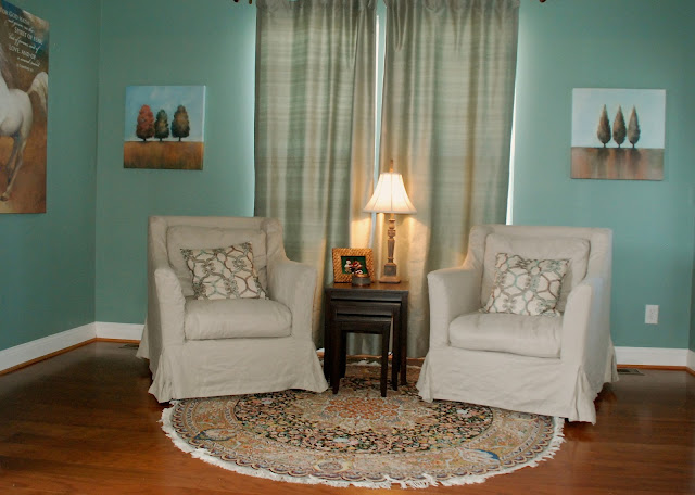
Your house is your home, but your bedroom is your refuge. This client wanted their bedroom to be just that - a place to relax, read, and have a peaceful night's rest.
The changes I made include changing the paint to a lighter shade as well as adding the color to the tray ceiling for more depth. I added a romantic chandelier, a bench at the end of the bed, chairs in the sitting area rather than the couch that was there and adding a few more pillows to the mix. It turned out beautifully!
As you can see, decorating doesn't have to be super expensive.
Enjoy! Julie
 |
| BEFORE |
 |
| AFTER |
 |
| BEFORE |
 |
| AFTER |
 |
| AFTER |
 |
| AFTER |
More for less...
This client needed to sell her home - quick! The house was nice but lacked the impact needed for a quick sale. Her realtor suggested she hire a professional...that would be me!
As you can see, the proportions of this room were tricky. It was long and narrow with the fireplace at the far end. To overcome the "bowling alley" effect, I decided to divide the room into two separate sitting spaces. One at the end so you could cozy up to the fire and one at the front with the piano for a nice place to chat with guests. Believe it or not, all we added was the light fixture, 2 new rugs, pillows, some accessories and painted the ceiling to create more depth. We spent less than $3000 to take this home from "nice" to "WOW!".
NOTE: The additional furniture came from other rooms in the house.
Enjoy! Julie
 |
| BEFORE |
 |
| AFTER |
 |
| BEFORE |
 |
| AFTER |
 |
| BEFORE |
 |
| AFTER |
Subscribe to:
Comments (Atom)


